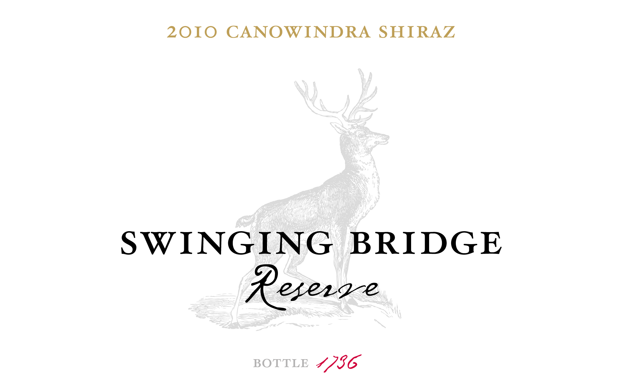
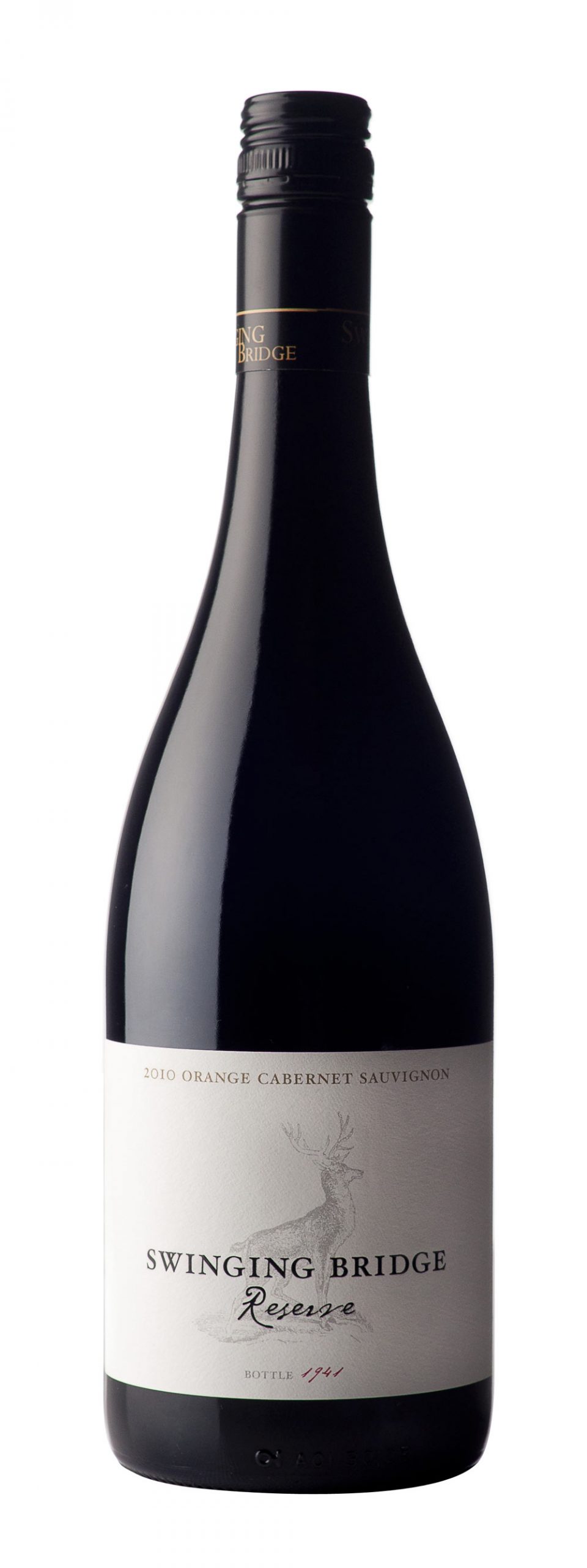
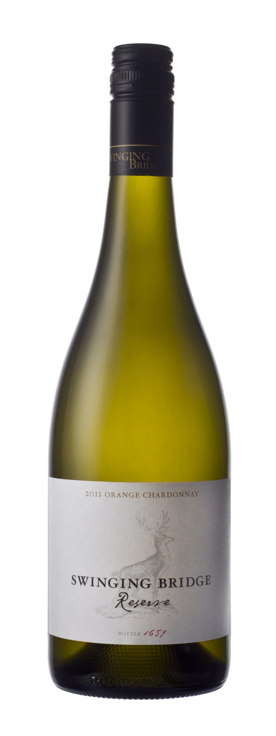
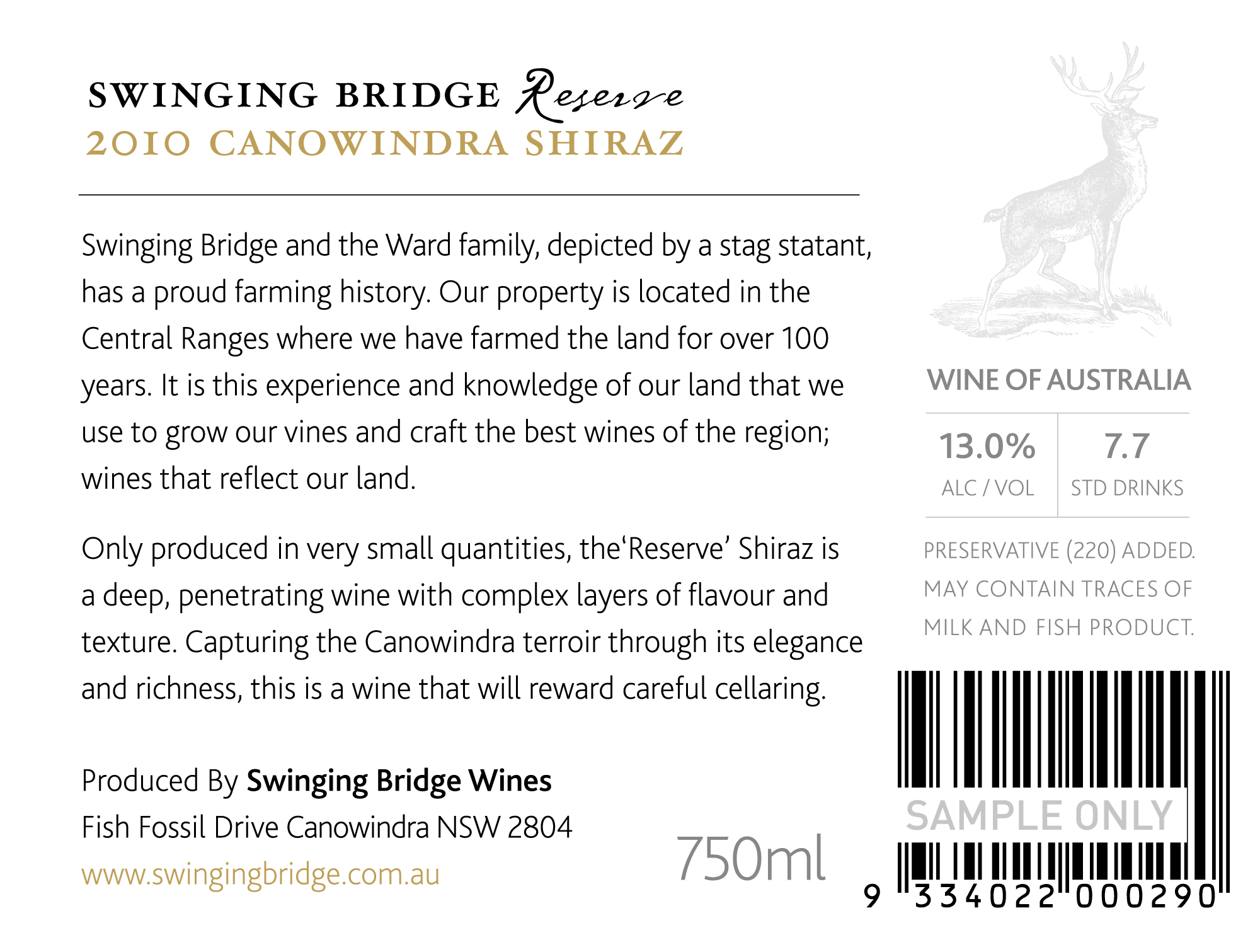
The first labels developed as part of the Swinging Bridge rebrand. Being the premium wines within the range, the design focus was less is more, with a traditional focus. The buck is taken from the Ward family crest. Premium cues were added through textured stock, high-build varnish and a minimal classic colour palette.
