Swinging Bridge TW Series

Swinging Bridge Wine Label Design TW Series

The TW series is for wines in the Swinging Bridge range that are more experimental and cutting edge in nature, such as natural wines. The label was originally designed to be printed on a cloth stock to reflect this. Premium bottle choice and cork / waxed tops were also utilised.

Swinging Bridge Single Vineyard

Swinging Bridge Single Vineyard Series

Sitting between the Estate Range and Reserve Range, the Single Vineyard Series was developed to showcase particular vineyards and resultant wines. Each has been named after a family member. NB. incorrect placement of neck label on Sparkling – it needs to sit at the bottom of the foil.

Swinging Bridge Reserve Range

Swinging Bridge Reserve Range Wine Label Design

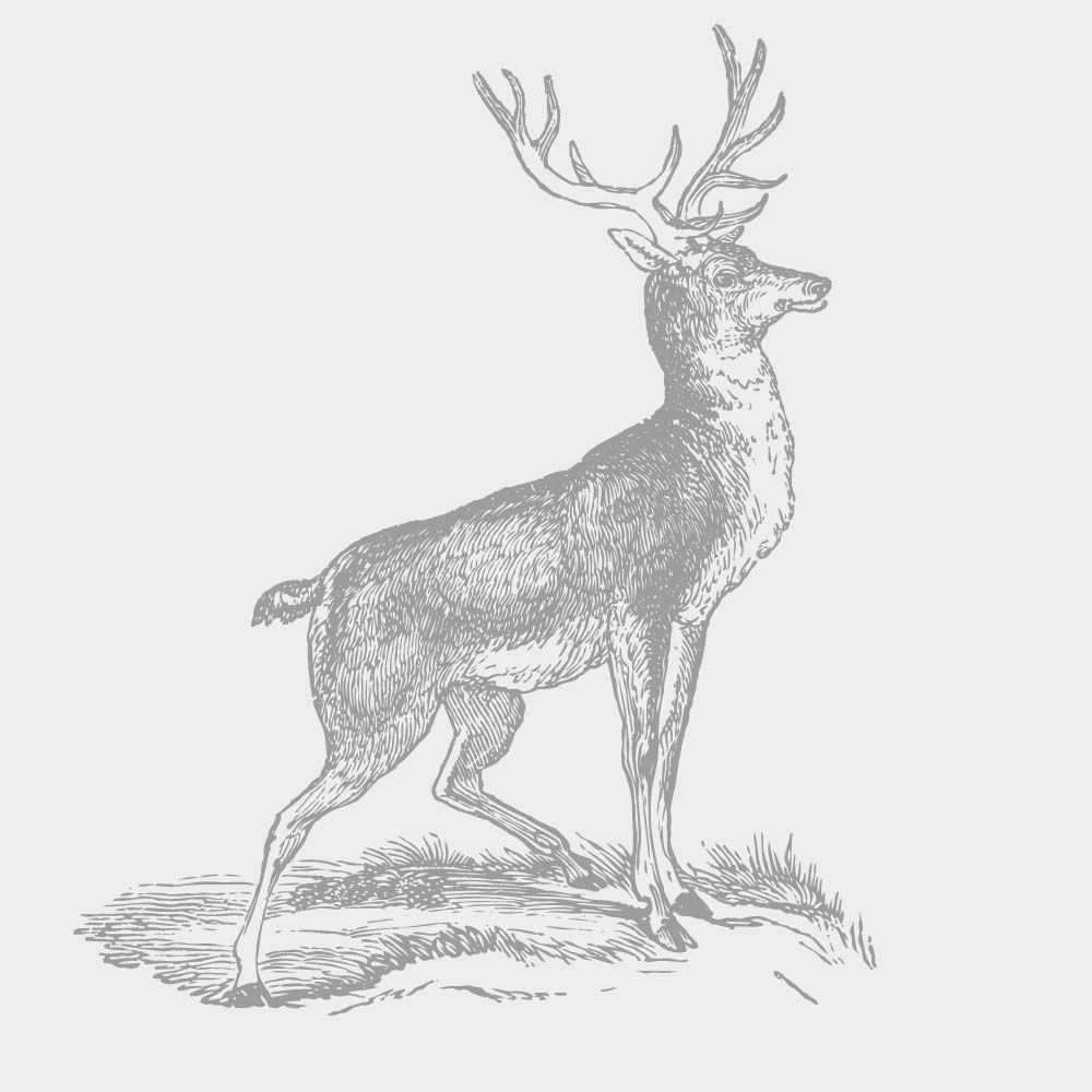
The first labels developed as part of the Swinging Bridge rebrand. Being the premium wines within the range, the design focus was less is more, with a traditional focus. The buck is taken from the Ward family crest. Premium cues were added through textured stock, high-build varnish and a minimal classic colour palette.

Swinging Bridge Estate Range

Swinging Bridge Wine Label Design

In 2011, Tom & Georgie Ward commissioned Define Wine & 3blindmice to review and redevelop the Swinging Bridge (SB) brand. As part of this process three pricing tiers were developed for the SB wine range: the Estate, Single Vineyard and Reserve ranges. Design-wise, the Reserve Range labels were developed first, followed by the Estate Range … Read more

Lowe Events

Lowe Events

Designed to support a series of events run by Lowe Wines, the postcards were to work like the Avant Card postcards you would find in cinemas and cafés. Each was to have it’s own style and they needed to be visually different. The design for each event would also run into supporting printed material such … Read more

Lowe Wine Labels

Lowe Wine Labels

2011 through to 2015 was a busy period working with Lowe Wines in Mudgee. A new website, multiple events to design ‘brands’ around and then work on the wine labels. The drive behind all was to infuse the brand with the Lowe family history and the personality of the people behind it, along with the … Read more

Fresh Fodder Soups

Fesh Fodder Soup Packaging Design

The Fresh Fodder soup range was designed to sit within the existing FF brand but to also take it in a new direction. The design needed to be bold to stand out on the visually competitive supermarket shelf; but also retain the Fresh Fodder small batch handmade feel. The packaging required a top, front and … Read more

Medical Imaging Logo

Developed for Western NSW Local Health District. The initial presentation to the client included six different concepts. The idea behind the selected concept was an abstract representation of moving to scan different parts of the body, but was also suggestive of connection.

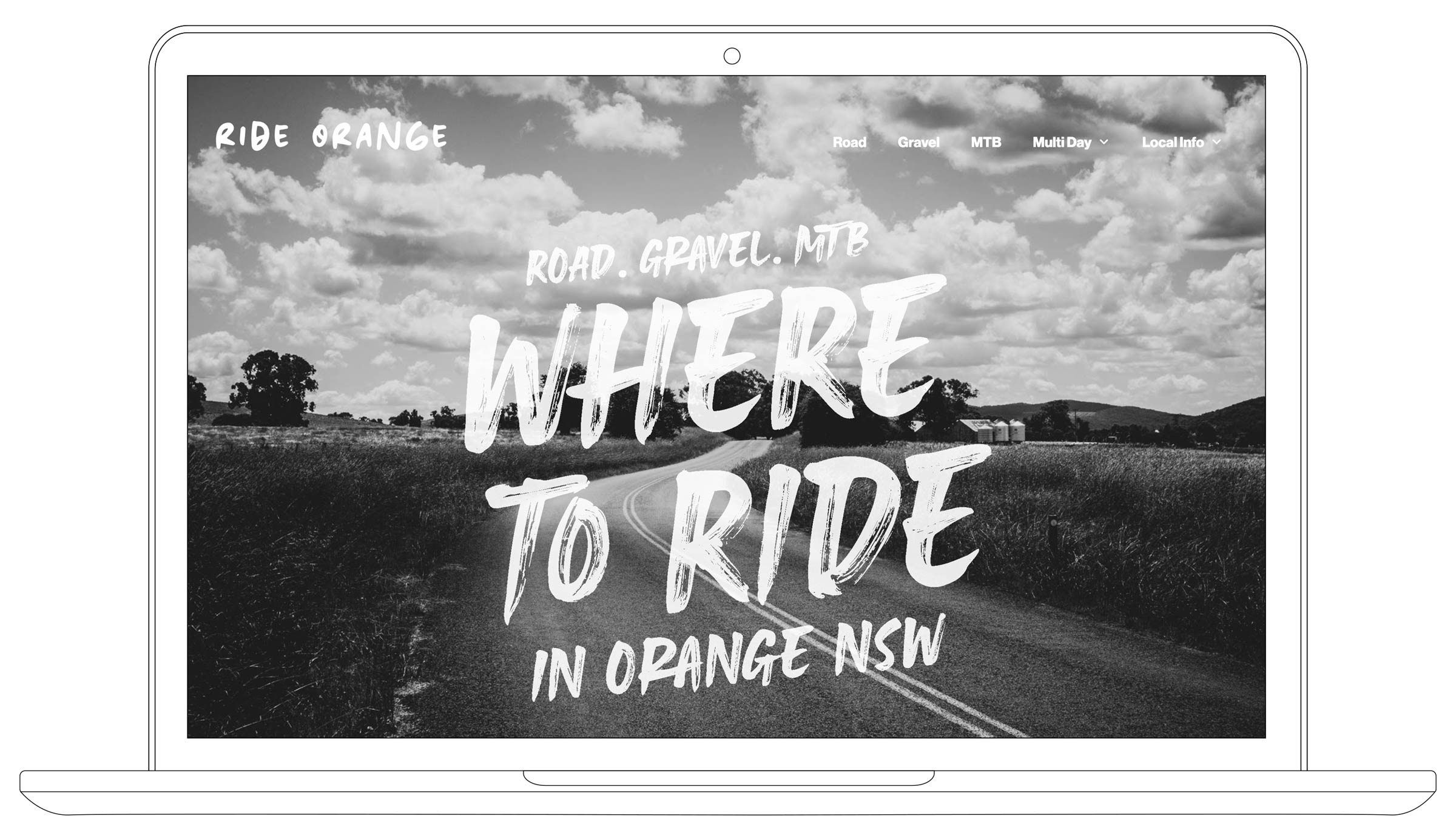
Ride Orange Website
VIEW PROJECT